
TL: DR
Are you not in the mood to scroll through the whole blog? We got you. Here’s a quick snapshot of what this post covers:
- Why heatmaps matter: Understand why visualizing air pollution is crucial for smarter, faster environmental decisions.
- From raw data to real insights: See how Envizom transforms complex sensor readings into intuitive, actionable heatmaps.
- Use cases that hit home: Explore how cities, industries, and researchers are using Envizom to drive impactful decisions.
- What sets Envizom apart: Dive into the technical strengths, from real-time mapping to high spatial accuracy and multi-layer views.
- The future is smarter: Get a glimpse of what’s next, AI-powered forecasting, geospatial analytics, and beyond.
Let’s get into it!
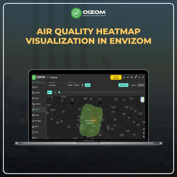
Air Quality Heatmap Visualization in Envizom
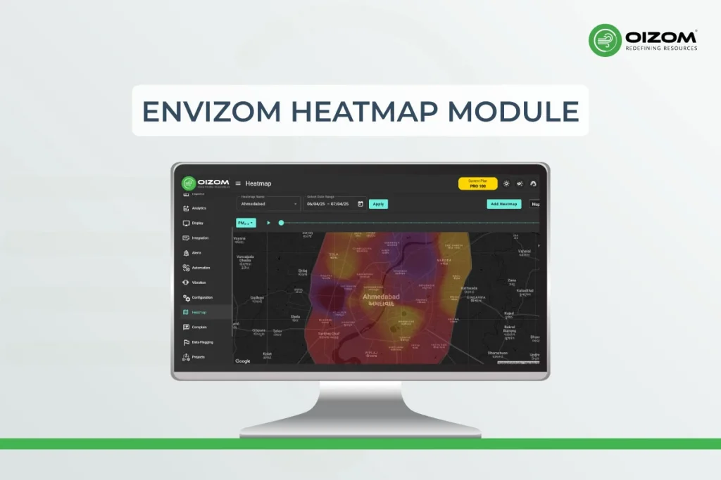
Understanding air quality data isn’t just about numbers; it’s about patterns, trends, and context. For environmental professionals, the ability to visualize spatiotemporal variations in pollutants is essential for meaningful analysis and decision-making. That’s exactly where Envizom’s new Heatmap Visualization module steps in.
Designed for experts who demand precision and clarity, this feature transforms complex sensor datasets into dynamic, color-coded heatmaps, helping you interpret pollution distribution across locations and time with ease. Whether you’re monitoring PM2.5 hotspots in urban areas or analyzing CO or NO2 dispersion around industrial zones, the heatmap module offers an intuitive yet technically robust way to explore real-time and historical air quality data.
In this blog, we’ll explore how air quality is measured and show you how Envizom’s heatmap visualization brings that data to life. From its technical capabilities to real-world use cases, you’ll get a clear view of how to make the most of this powerful tool for smarter, data-driven air quality monitoring.
Air Quality Monitoring: From Complicated to Smart
Monitoring ambient air quality used to be a difficult, time-consuming task, taking days or even weeks for a single reading. But not anymore. Thanks to scientific progress, we now have smarter, faster, and more flexible ways to track air pollution.
Direct Sampling
This method involves collecting air samples, either as a quick “grab” at a moment in time or through integrated sampling over longer durations. These samples are then analyzed in labs.
Continuous Monitoring
Want real-time updates? Continuous monitoring uses fixed stations with advanced technology (like UV absorption for O₃ or chemiluminescence for NO₂) to give a live picture of air quality changes.
Standard Methods
To keep things consistent and trustworthy, environmental agencies like the EPA have set reference methods and standardized ways of measuring specific pollutants.
What’s New?
The game is changing with cutting-edge tech, portable monitors, drones, satellites, IoT, and AI, which are making air quality data more accessible, accurate, and fast.
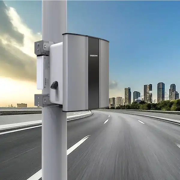
How Oizom is Leading the Way
Oizom offers real-time, plug-and-play air monitoring solutions. Our IoT-powered devices track pollutants like PM1, PM2.5, PM10, and PM100, CO, NO₂, SO₂, O₃, and VOCs, plus weather parameters like temperature, humidity, and wind.
Our systems ensure wider coverage and high-resolution data from stationary to portable devices. Plus, with built-in AI and forecasting capabilities, you get more than just numbers; you get insights you can act on.
Why Heatmap Visualization Matters in Air Quality Monitoring
Understanding air quality is key to making better decisions and shaping effective policies. But raw data alone can be overwhelming, especially when it’s large and complex. That’s where visualizations come in. They simplify the data, making it easier for researchers to analyze trends and for communities and stakeholders to clearly understand what’s happening in their environment.
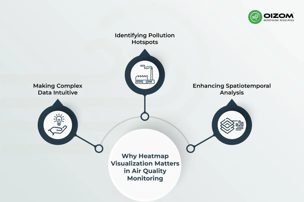
Making Complex Data Intuitive
Air quality monitoring often involves handling vast amounts of sensor data, multiple parameters, different timeframes, and varying locations. Interpreting this in raw numerical form isn’t just time-consuming; it’s inefficient. Heatmap visualization in Envizom addresses this challenge by transforming raw data into easy-to-read, map-based layers. Each color represents a specific concentration range, instantly showing where pollution levels are normal, elevated, or critical. This not only reduces the cognitive load but also allows for faster interpretation and decision-making, especially in time-sensitive scenarios.
Identifying Pollution Hotspots
One of the core strengths of heatmaps lies in their ability to pinpoint pollution hotspots at a glance. Whether it’s a spike in PM2.5 around a traffic-heavy junction or elevated SOx and NOx levels near an industrial area, the heatmap visually highlights the problem zones. With real-time and historical data overlays, users can identify recurring issues, unusual spikes, or seasonal patterns, all without digging through rows of tabular data. This leads to quicker, more targeted interventions, improving response strategies for EHS teams, urban planners, and policy-makers alike.
Enhancing Spatiotemporal Analysis
Air pollution isn’t static; it fluctuates across time and geography. Envizom’s heatmap module enables users to analyze spatiotemporal dynamics by viewing how pollutant concentrations evolve over hours, days. With selectable parameters and adjustable timelines, users can conduct in-depth pattern analysis, evaluate source behavior, and correlate events with emission trends. This level of insight is invaluable for compliance reporting and long-term policy planning.
Air quality isn’t constant; it changes across time and location due to factors like local emissions, weather conditions, and terrain. This makes it difficult to capture and represent pollution levels accurately with static maps alone. Understanding how pollution behaves throughout the day or across seasons is essential for identifying sources and planning effective solutions.
To tackle this, we use tools like time-series plots to track changes over time and heatmaps to visualize how pollution spreads across different areas. In Envizom, the heatmap module brings these insights together by showing real-time, color-coded pollution levels across monitoring stations. Users can select parameters like PM2.5 NOx and SOx and view how concentrations shift by hour, and day.
Envizom also supports overlays and correlation views, helping users see how air pollution relates to factors like traffic flow, industrial activity, or weather. This makes it easier to spot patterns, trace sources, and take timely action. The result is a powerful, interactive tool for spatiotemporal analysis, supporting everything from regulatory compliance to long-term air quality planning.
Overview of the Heatmap Module in Envizom
The heatmap module in Envizom is designed to bring clarity and context to complex air quality data through advanced visual mapping. It transforms large datasets from distributed air quality sensors into an interactive, real-time visualization layer, enabling users to quickly assess pollution levels across different locations.
Real-Time Data Mapping
At the core of the heatmap module in Envizom is its ability to map air quality data in real time. As sensors deployed across multiple locations send continuous data streams, the platform dynamically updates the heatmap, offering instant visibility into pollution trends. This real-time mapping allows users to monitor fluctuations as they happen, making it ideal for situations where rapid response is crucial, such as during industrial incidents, festivals, or weather shifts. Each data point is geotagged and time-stamped, enabling high-resolution spatial and temporal accuracy.
Customization and Layers
Envizom gives users full control over what they want to visualize. You can easily select from various environmental parameters, PM2.5, PM10, gases like NO₂, SO₂, and CO. The heatmap adapts instantly, using customizable color gradients to highlight concentration ranges. Users can also switch between timeframes, hourly, daily, weekly, or focus on specific zones like neighborhoods, industrial clusters, or traffic corridors. This layered approach not only enhances analysis but also helps correlate multiple parameters in a single view, which is valuable for identifying combined effects or emission patterns.
User-Friendly Interface
Despite its technical depth, the heatmap module is designed with ease of use in mind. The intuitive interface allows even non-technical users, like urban planners, government officials, or community stakeholders, to navigate the system with minimal learning curve. From toggling parameters to exporting reports, every interaction is streamlined to ensure that insights are accessible and actionable, no matter your technical background.
Use Cases Across Industries
Envizom’s heatmap module is not just a visualization layer. It’s a powerful decision-making tool designed to meet diverse industry needs. Converting complex air quality datasets into intuitive spatial visuals empowers professionals to take targeted, data-driven action across sectors.
Urban Planning and Smart Cities
In rapidly growing urban areas, understanding pollution distribution is key to building healthier cities. Envizom’s heatmap helps urban planners identify pollution hotspots in real-time, whether due to traffic congestion, industrial clusters, or construction activity. Planners can overlay data across timeframes to analyze daily, weekly, or seasonal variations, enabling smarter decisions around traffic rerouting, zoning regulations, or green infrastructure planning. With this level of insight, cities can design more effective low-emission zones, optimize the placement of green corridors, and monitor the impact of policy interventions over time.
Want to see how Envizom works in action? When it comes to air quality, even the most advanced research facilities need precision and reliability. That’s why, one of the India’s premier scientific institutions BARC Mumbai chose Oizom’s Polludrone for effective air quality management in and around. With Envizom, BARC gets regular automated reports on air quality within and around the facility, enabling it to take proactive, data-driven action whenever needed.
Industrial Emissions Monitoring
Industries must ensure their emissions remain within regulatory limits, but monitoring can be challenging, especially with multiple emission points and shifting atmospheric conditions. Envizom’s heatmap enables continuous emissions mapping, offering visibility into how pollutants like SO₂, NO₂, or PM are dispersing across and beyond the site. With parameter-based alerts, historical trend analysis, and wind direction overlays, environmental managers can pinpoint the source of exceedances, evaluate mitigation strategies, and maintain documentation for compliance audits. This leads to not only better reporting but also proactive environmental risk management.
Environmental Research and Policy
Researchers and policymakers require tools that bridge data complexity with clarity. Envizom’s heatmap supports multi-parameter analysis, helping users correlate pollution levels with meteorological data, land use patterns, or socio-economic zones. The visual outputs are ideal for policy briefs, academic papers, and community awareness campaigns. By offering a dynamic, spatial perspective of environmental trends, the module becomes a critical asset in impact assessment, regulatory design, and public communication.
What Sets Envizom’s Heatmap Apart
Envizom’s heatmap module isn’t just a visual enhancement. It’s a technically robust tool designed to deliver accurate, real-time environmental insights for professionals who rely on precision.
- Real-Time Updates: The module continuously pulls data from connected monitoring devices and updates the heatmap instantly. This allows users to observe pollution events as they happen, enabling faster decision-making in dynamic environments like industrial zones or urban hotspots.
- High Spatial Accuracy: Envizom’s heatmap delivers fine-grained 250*250 m2 grid resolution by leveraging high-density sensor networks. Each data point is geotagged and accurately calibrated, allowing the system to interpolate values between monitoring locations with precision. This ensures that the spatial distribution of pollutants is mapped with a high degree of accuracy, enabling users to pinpoint micro-level variations across cities, industrial zones, campuses, or any targeted area. The result is a highly detailed and reliable environmental heatmap that supports precise air quality assessments and informed decision-making.
- Multiple Parameter Selection: Users can choose from a wide range of parameters: PM1, PM2.5, PM10 and PM100 along with, gases (NO₂, SO₂, CO), temperature, and humidity and view them individually or in correlation. This multi-layered capability is ideal for advanced diagnostic assessments and cross-parameter analysis.
- Seamless Integration: The heatmap is fully integrated into the existing Envizom dashboard. Users can toggle views, apply filters, overlay data, or correlate readings without switching platforms, making the experience smooth, unified, and efficient.
- Export and Reporting Tools: With built-in export features, users can generate custom reports, download heatmap snapshots, or share visuals directly with stakeholders. This simplifies compliance reporting, internal reviews, or research documentation.
- Envizom’s Heatmap stands out by using advanced Inverse Distance Weighting (IDW) to create accurate environmental heatmaps. It doesn’t just show pollution levels; it combines wind speed, direction, temperature, and humidity to show how pollution spreads in real-time. The result? Clear, color-coded maps that help you spot hotspots, track emission sources, and take action faster. Whether you’re managing air quality in a city or at an industrial site, Envizom’s Heatmap gives you simple, powerful insights to make better decisions.
Understanding IDW Interpolation:
Imagine you have air quality data from a few monitoring stations spread across a city. But what if you want to know the air quality in places where you don’t have sensors? That’s where interpolation methods come into play. They help you predict unknown values based on known data points.
Interpolation is essentially estimating values at new locations using the information from existing data points around it. There are several interpolation methods, but one popular and intuitive method is Inverse Distance Weighting (IDW).
So, how does IDW actually work?
IDW assumes that things closer together are more similar than things farther apart. Simple, right? The logic is like this: if you want to know the air quality at a particular location, you look at nearby monitoring stations. The closer a station is to your unknown point, the more influence its data has on your estimated value.
Here’s the process in a nutshell:
- Select Nearby Points: Identify known data points (like air quality sensors) around the location you want to estimate.
- Calculate Distance: Compute the distances from your target location to each of these known points.
- Assign Weights: Give each known point a “weight” based on distance. Points closer get higher weights, while points farther away get lower weights.
- Estimate the Value: Finally, take a weighted average of the known points’ values. This gives you the estimated air quality for your unknown location.
It’s like asking your closest neighbors for recommendations, they’re likely to know more about your local area than someone from across town. The beauty of IDW lies in its simplicity and intuitive logic, making it popular for environmental monitoring, weather mapping, air quality analysis, and much more.
Envizom Heatmap vs. Traditional Monitoring Methods
To help you understand the value Envizom brings to air quality monitoring, here’s a quick comparison between traditional monitoring methods and the Envizom Heatmap module.
This table highlights key differences across essential features.
| Feature | Traditional Monitoring | Envizom Heatmap |
|---|---|---|
| Real-time updates | ❌ | ✅ |
| Spatial accuracy | Low | High (IDW-based) |
| Multi-layer parameter view | ❌ | ✅ |
| Data overlays | ❌ | ✅ |
| Export & reporting tools | Limited | Comprehensive |
Conclusion
Envizom’s heatmap module bridges the gap between complex air quality data and actionable insights. Converting real-time sensor inputs into intuitive, high-resolution visualizations empowers professionals to analyze pollutant behavior across time and space, a critical capability for urban planning, industrial monitoring, and research applications.
With features like real-time updates, high spatial accuracy through IDW interpolation, multi-parameter layering, and seamless dashboard integration, Envizom ensures users can respond faster, track trends more effectively, and report with confidence. Whether you’re identifying PM2.5 hotspots, correlating gas levels with wind direction, or validating emission control strategies, the heatmap offers the clarity needed for data-driven decisions.
Looking ahead, the future of air quality monitoring will be increasingly predictive and automated. Envizom is evolving to integrate AI-powered forecasting, advanced geospatial analytics, and multi-source data fusion, bringing even deeper intelligence to environmental management. The heatmap module is just the beginning of a broader vision: turning environmental data into a real-time decision engine for cities, industries, and communities.
As air quality challenges become more complex, tools like Envizom’s heatmap will play a key role in helping us not just observe but understand, anticipate, and act.